RESUMÉ


DAVID G. SMITH

  • CARING:
» OVERNIGHT GROCERY STOCK CLERK: Wegmans ['09-Present]
Part-time night crew. Enjoying being on a Fortune “100 Best...” team at Wegmans Store #04, Fairport Road.

» GROCERY STOCK CLERK: Tops Markets ['05- '08]
Part-time weekend days (plus occasional nights) at Tops Store # 417, Panorama Plaza; lots of friendly interaction! “Employee of the Month” for over a year.

» “MR. MOM” ['99-Present]
First daycare, now after-school care provider for our two kids, from newborn through grade school.

  • CREATIVE:
» GRAPHICS / PHOTO / AUTHORING TALENT ['01-'04]
Created fundraiser ads, posters, promotional DVD, newsletter content, etc. for local Montessori School.

» PHOTO EDITOR -- “HazMat Review” ['01-'04]
Enhanced & optimized photos for publication in esteemed small press literary magazine.

» INSTRUCTOR -- “Intro to Writing” ['01]
Taught how to write more and better in any field or genera, at a local non-profit writing center.

» AUTHOR -- “JVOX ['93]
Demoed voice-driven programming in J. Explored verbal interface issues. Published in 1993 ACM/IEEE SIGAPL Proceedings, as lead author.
  • CAPABLE:
» OCCASIONAL FREELANCE CONSULTING ['99-'03]
Software marketing strategy support, GUI analysis and feedback, pre-alpha testing, etc. Separately, designed logo family for financial-markets data analysis software products; overhead slides & script for product launch. Tradeshow layout, staff action planning, overhead slides, scripts, and screen-saver design.

» SENIOR INSTRUCTIONAL DESIGNER / INDEPENDENT CONSULTANT ['90-'98]
Instructional design and training development services, mainly to Eastman Kodak Company. Performed front-end analysis, proposal writing, detail task analysis, designed specifications, and guided development and delivery of top-quality training programs dealing with consumables, hardware, computers, and quality initiatives.

» PRODUCT MANAGER: EMAIL ['90]
Rescued international team developing PC-based electronic mail product. Resolved personnel and morale problems. Brought focus to practical issues of requirements analysis, functional specs, graphical user interface design, documentation, packaging, and test procedures. Served two product manager functions concurrently. Proposed elimination of my own position.

» PRODUCT MANAGER: SAX (SHARP APL under UNIX) ['88-'90]
Protected customer goodwill and corporate assets during ramp-down of unprofitable product line. Negotiated contracts and built up VAR/OEM relations. Balanced austerity with ongoing marketing and customer support. Rationalized administration to give senior management accurate reports. Helped defend market position by answering legal interrogatories in trade-mark challenge and arbitration cases.

» ACCOUNT MANAGER: SHARP APL under MVS ['86-'88]
Twice doubled revenues from annual software license-fees. Negotiated “win-win” agreements worth millions with Morgan Stanley, a major Wall Street investment banking firm, growing account to become single largest customer. Other Fortune-500 clients included CitiBank, Upjohn and Kodak, as well as Southwest Airlines and others.

» INSTRUCTIONAL DESIGNER / INDEPENDENT CONSULTANT ['85]
Provided instructional design and development services to Eastman Kodak’s Graphics Imaging Systems Division at Kodak’s Marketing Education Center.

» TRAINING DESIGNER / INSTRUCTOR / AUTHOR / APL PROGRAMMER ['77-'85]
Taught APL programming and trained instructors in the U.S., Canada, and U.K. Authored, illustrated, and contributed to reference manuals, promotional, training and other materials. Participated in all aspects of software engineering as team member and team leader, including software maintenance, conversions, systems analysis, systems design and specification, program construction and systems integration, evaluation and testing, and packaging and delivery.

» SIGN-LANGUAGE INTERPRETER FOR DEAF PEOPLE ['73-'77]
Simultaneous word-for-word translation of college lectures, meetings, etc. between spoken and “signed” English, for the benefit of deaf students, faculty and staff. Twice voted “Best Interpreter” by student body. First recipient of RIT/NTID administration’s annual “Frisina Award” for personal contributions to the advancement of deaf students.
StockClerk Dave?

A lot of people pay money and go to the gym for exercise. Instead, I went to the supermarket, and they paid me! My part-time exercise program "disguised" as a stock clerk for a large regional grocery store chain never amounted to much else, but it was sure a lot of fun! I especially enjoyed the continual interaction with people of all sorts.

Along the way I noticed there were a lot of grocery store terms that nobody, so far as I know, had ever documented.

Well, documenting is in my blood. Thus, just for fun, the Stock Clerk Glossary was born! Take a peek: StockClerk-glossary-b.blogspot.com.

Along the way, I learned how to use a LOT of HTML, CSS, and, well, pure determination to coax Blogger into a tabbed glossary format. That experience later paid off, allowing me to seamlessly bolt a Blogger blog onto a customer's website while retaining that other site's look and feel. (See, "And this just in,..." below).

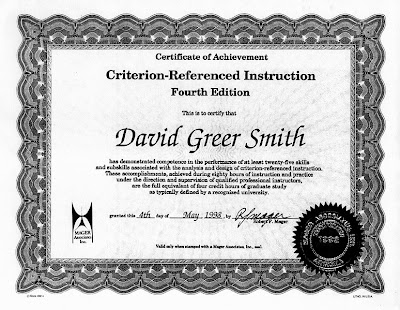
Mager/CRI Certified

For years as a professional Instructional Designer I had Eastman Kodak Company as key client. Then, one day Kodak decided to weed out any training consultants that weren't certified by then-top-ID-guru Robert F. Mager.

Now, my credentials are generally of the "proven, can-do, satisfaction guaranteed" variety. But, no problem. I simply enrolled in an evening Graduate Studies course at the Rochester Institute of Technology. There, even though I already knew of, read, admired and routinely put into practice lots Mager-wisdom, I had a great time. Especially with the "reflexive" aspect of the course. That is, it self-referentially used the principles of Criterion-Referenced Instruction to teach CRI itself. Fun, fun, fun! One principle I like most is that students can know for sure whether or not they really "got it."

And so, badda-bing... a few short weeks later I showed Kodak the paper they wanted to see.

Of course, my original certificate has a nice, shiny gold seal. Let's hope this photocopy suffices until I can put my hands on it. Creating gold in Photoshop is no trouble, but integrity is of higher value.

There are some things you just can't fake; while others you can, but shouldn't.

Teach SPC - Backwards!

Yep, it's true! It’s sometimes best to tackle whatever's "hardest" first, and leave easier things for last.

Instructional Designers call this a "regressive" learning model, and for teaching SPC, or Statistical Process Control, it's a perfect fit. That's because to work best, training should go beyond subject matter, and also take into account the state of the participants themselves.

Just consider: why are the most complicated things usually taught at the very end of a course, when people are tired, brains are full, and everyone’s thinking of home? The answer is more often "it's traditional" than "it's truly necessary."

Back at the beginning of a course is when everyone is most rested, most interested, and most ready to learn. So, don't waste their precious attention on minutia. Hit the deck running! Throw 'em in at the deep end! In SPC terms, that means ramp up fast, and do X-bar and R Control Charts right away. Follow up with a genuinely necessary (and easier) prerequisite: Histograms. And then, wham-o! The biggie: Process Capability!

Crazy? Nope. Not if you prepare.

"Hard" First, "Easy" for Dessert

Here’s the whole better, "backwards" flow:

  1. Control Charts
  2. Histograms
  3. Process Capability
  4. Run Charts
  5. Brainstorming
  6. Flow Charts
  7. Cause-and-Effect Diagrams
  8. Scatter Diagrams
  9. Pareto Charts

It’s an ambitious agenda, yes. But Day One ends with a Run Charts snack, and everyone happy and sated.

Day Two begins with Brainstorming (easy), and is intended to be a total breeze. Everyone’s supposed to relax and have fun (translation: “learn better!”). And who wouldn't, since all of the tough stuff is already behind them!

Got Trailguide?

None of this works, of course, unless each person gets a complete, step-by-step trailguide -- a course workbook chock full of explanations and examples that are 100% relevant to their work back on the job. It’s got to all be about what they reach out and touch on a daily basis. For manufacturers, maybe it really is about the usual nuts and bolts found in most SPC texts. However, for printers, it’s got to be about printing. For florists, flowers. And so on. Because, if training is to succeed, it has to matter personally -- to them!

Exercises should thus involve tools and take-aways they'll use later. Like terse visual glossaries (see middle column, illustration), fill-in the blank forms, “cheat sheets,” or other job aids. But, whoa! Don’t back up a truck! Keep everything lean and mean. Focus on a minimal solution that yields the maximum desired effect.

Good Instructional Design will smooth out the bumpy spots, so folks can enjoy their ride. Plenty of little self-check exercises hone skills, and let each person prove to themselves, every step of the way, that “Hey, I actually ‘got it.’” These opportunities for practice during class, while expert coaching is still readily available, are extremely important. But, if you follow a strictly progressive learning model -- with its traditional crescendo of difficulty up to a Big Bang finish -- they don't even exist.

So, I tell ya' -- the regressive learning model -- ya just gotta love it. It's often a much better way. And I've seen enough course evaluations to prove it.

Finally, even the greatest course design is nothing without great content and great delivery. Special thanks to statistician Pete Bartell for his brilliant contributions as Subject Matter Specialist and lead instructor!

CRI Training for Desktop Color Proofers

Both careers and fortunes may literally be at risk, so long before jobs ever go to press, everyone and his uncle wants to know, “How’s it going to look?”

Enter the “color proof.” It’s sole purpose is to confirm that all files, films, and you-name-it are 100% correct. The farther upstream in the process problems get caught and corrected, the better and cheaper it is for everyone. And better and cheaper are huge driving forces in the printing industry, same as everywhere else.

Enter the Digital Desktop Color Proofer, or DCP. If you imagine a large desktop color printer, but with far more accurate color, many more capabilities, and control options galore, you’ve got the general idea.

I got to design training for two of Eastman Kodak Company's early forays into the DCP arena. The second involved a third-party RIP, or raster image processing engine, that was even more complex than it was powerful. In short, it was a beast! Talk about your design challenge!

Admirable Bird's-Eye View?

Here's an overview of a my solution:


Front-end analysis revealed I could divide the program into three increments: Users, Queue Managers, and System Administrators. Users would take just the first stage, Queue Managers the first two, and System Administrators all three.

Each stage was divvied up into bite-sized modules. This yielded a highly hands-on, self-study, self-paced, lab for teams of participants. Teams were proctored by a Course Manager who could answer questions, provide hints, fix problems, and so on.

Participants followed maps like you see above, showing which course modules ought to be tackled in what order. Starting at the bottom arrows, they’d work upward along whatever connections they choose, so long as they didn't skip links to lower-down prerequisites.

For instance, if you’d just completed the blackened-in CIO module in the middle of the above picture, you'd be free to choose either the SIO or VPD module next. However, not MJQ, because MJQ depends on things you’d first need to learn in VPD. In such fashion, you’d eventually visit all relevant modules and complete the course.

Of course lots of worksheets, samples, guided exercises and opportunities for self-evaluating progress were provided. Nobody was hurried or deprived of a chance to explore possibilities or variations at their leisure. Likewise, nobody was held back if they made rapid progress.

This strategy works well because it shows participants all the bases they need to cover, and then gives them as much freedom as possible to enjoy their learning experience. Such freedom is a built-in characteristic of the CRI -- Criterion-Referenced Instruction -- methodology.

Naturally it's a lot of work to do all of the up-front detailed task analysis, development of sound instructional objectives and many other things required by this approach. However, the end result is a training program that you can prove genuinely delivers on all its promises. So it's certainly well worth it.

“And this just in...”

Thanks to a wonderful client, I've recently had a great time doing a printed brochure and accompanying website update for Chateau Hair Designs. Here's a quick summary:
  • Revised, redesigned a new printed BROCHURE about services and prices, integrating look and feel elements from new storefront signage into a tri-fold layout
  • Revised, redesigned a new WEBSITE from legacy site materials to match printed brochure, including look and feel
  • Upgraded website HTML and CSS to full standards compliance*, including a footer link for live verification
  • Added CSS rollover effects to provide some additional details on selected items
  • Integrated a new BLOG at Blogger.com with the client's site, overriding Blogger elements and styles to preserve that same consistent look and feel
  • Enhanced photos to add "watermarks" where appropriate, and improve web appearance overall
  • Integrated a new Web GALLERY at Picasa.com with the client's new blog
  • Vetted additions and changes with multiple browsers, on multiple platforms
  • Provided a private, "shadow" site and blog to allow non-disruptive preparation and testing of future updates
  • Preserved legacy information by keeping the entire previous version of the site available on demand through a footer link

* Unfortunately, it's common practice for public hosting agency web servers to insert additional code, such as ads, which won't pass standards validation. Oh, well... At least we do our part!

Dentist's Logo


The brand message here is "Top quality, warmth and caring." Usable either in color or monochrome, three-dimensional or flat, it's for stationary, uniform embroidery, jewelry, and so on.

With minimal address copy, it's also been run as a magazine ad.

I know, I know. As professionals, we're supposed to love all our "children" equally. Yet, for me, there's just something a little extra-special about this one.

The dentist being my wife surely has nothing to do with it.